
灰度图像悬停(滤镜)
-
实现代码
<style> .filter{ filter: grayscale(1); transition: 0.5s linear; } .filter:hover{ filter: grayscale(0); } </style> <img class="lazy-load filter" src="filter.jpg" width="400px" height="auto"/> -
效果展示
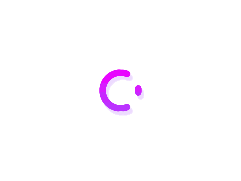
旋转加载动画
-
实现代码
<style> #loading{ width: 300px; height: 300px; border-radius: 10px; perspective: 800px; position: relative; background: #000; } #loading .item{ width: 100%; height: 100%; border-radius: 50%; position: absolute; } #loading .item:first-child{ border-bottom: 7px solid #fdea2e; transform: rotateX(35deg) rotateY(-45deg); animation: rotate-one 1s linear infinite; } #loading .item:nth-child(2){ border-right: 7px solid #f40968; transform: rotateX(50deg) rotateY(10deg); animation: rotate-two 1s linear infinite; } #loading .item:last-child{ border-top: 7px solid #77d970; transform: rotateX(35deg) rotateY(55deg); animation: rotate-three 1s linear infinite; } @keyframes rotate-one { to { transform: rotateX(35deg) rotateY(-45deg) rotateZ(360deg); } } @keyframes rotate-two { to { transform: rotateX(50deg) rotateY(10deg) rotateZ(360deg); } } @keyframes rotate-three { to { transform: rotateX(35deg) rotateY(55deg) rotateZ(360deg); } } </style> <div id="loading"> <div class="item"></div> <div class="item"></div> <div class="item"></div> </div> -
效果展示
鼠标经过文字特效
-
实现代码
<style> #title{ position: relative; height: 50px; line-height: 50px; font-size: 40px; cursor: pointer; width: 100px; text-align: center; } #title::before, #title::after{ content: ''; position: absolute; left: 0; right: 0; height: 2px; background-color: #fc2f70; transform: scaleX(0); transition: transform 0.5s ease; } #title::after{ bottom: 0; transform-origin: center left; } #title:hover::after{ transform-origin: center right; transform: scaleX(1); } #title::before{ top: 0; transform-origin: center right; } #title:hover::before{ transform-origin: center left; transform: scaleX(1); } </style> <div id="title">你好</div> -
效果展示
你好
输入框点击动画
-
实现代码
<style> #inputDiv { width: 147px; height: 21.5px; display: flex; position: relative; } #inputDiv .bottom, #inputDiv .top{ width: 100%; display: inline-block; position: absolute; height: 2px; left: 0; right: 0; transform: scaleX(0); background: red; } #inputDiv .left, #inputDiv .right{ height: 100%; display: inline-block; position: absolute; width: 2px; top: 0; bottom: 0; transform: scaleY(0); background: red; } #inputDiv .top{ top: 0; } #inputDiv .bottom{ bottom: 0; } #inputDiv .left{ left: 0; } #inputDiv .right{ right: 0; } #inputDiv>input:focus~.top, #inputDiv>input:focus~.bottom { background: red; transform: scaleX(1); transition: transform 0.5s ease; } #inputDiv>input:focus~.left, #inputDiv>input:focus~.right { background: red; transform: scaleY(1); transition: transform 0.5s ease; } </style> <div id="inputDiv"> <input type="text" placeholder="请输入姓名"/> <span class="bottom"></span> <span class="right"></span> <span class="top"></span> <span class="left"></span> </div> -
效果展示
图片水滴动画
-
实现代码
<style> #water{ width: 200px; height: 200px; background-image: url('/article/fc4c2c54299/meimei.jpg'); background-repeat: no-repeat; border-radius: 45% 55% 70% 28% / 45% 40% 55% 48%; background-size: cover; background-position: center; overflow: hidden; box-shadow: 0px 0px 15px rgb(255, 255, 255, 0.25); animation: bold 2s linear infinite; } @keyframes bold{ 0%, 100%{ border-radius: 45% 55% 70% 28% / 45% 40% 55% 48%; } 40%{ border-radius: 45% 30% 35% 48% / 28% 20% 70% 70%; } 80%{ border-radius: 100% 50% 50% 100% / 100% 100% 50% 50%; } } </style> <div id="water" /> -
效果展示
按钮 hover 动画
-
实现代码
<style> #btn{ position: relative; color: #fff; padding: 5px 10px; background: #ff2741; cursor: pointer; display: block; } #btn::before{ content: ''; z-index: -1; position: absolute; top: 0; bottom: 0; left: 0; right: 0; border: 4px solid #ff2741; transform-origin: center; transform: scale(1); } #btn:hover::before{ z-index: 1; transition: all 0.75s ease-in-out; transform-origin: center; opacity: 0; transform: scale(1.75); } </style> <button id="btn">点击</button> -
效果展示
探照灯动画
-
实现代码
<style> #border-rotate{ width: 200px; height: 200px; box-shadow: 16px 14px 20px #000000; border-radius: 10px; position: relative; overflow: hidden; display: flex; justify-content: center; align-items: center; } #border-rotate::before{ content: ''; background-image: conic-gradient(#fe2441 20deg, transparent 120deg); width: 150%; height: 150%; position: absolute; animation: rotate 2s linear infinite; } #border-rotate:hover::before{ animation-play-state: paused; } @keyframes rotate{ 0%{ transform: rotate(0deg); } 100%{ transform: rotate(-360deg); } } </style> <div id="border-rotate"></div> -
效果展示
霓虹灯边框
-
实现代码
<style> .profile{ display: flex; width: 200px; height: 200px; border-radius: 16px; background-color: #1b2028; position: relative; color: #f1f3f3; overflow: hidden; background-clip: padding-box; justify-content: center; align-items: center; } .profile>p{ z-index: 1; } .profile::before{ content: ''; position: absolute; width: 100px; height: 140%; background-image: linear-gradient(180deg, rgb(0, 183, 255), rgb(255, 48, 255)); animation: rotateBgimg 4s linear infinite; transition: all 0.2s linear; } .profile::after{ content: ''; position: absolute; background: #07182e; inset: 5px; border-radius: 15px; } @keyframes rotateBgimg{ from{ transform: rotate(0deg); } to{ transform: rotate(360deg); } } </style> <div class="profile"><p>hello</p></div> -
效果展示
hello
跳动的心
-
实现代码
<style> #heartDom{ font-size: 40px; color: #fc2f70; animation: heart 0.3s infinite alternate; transition: all 0.5s; display: block; width: 20px; height: 20px; margin: 20px; } @keyframes heart{ to{ transform: scale(1.5); color: red; } } </style> <i id="heartDom" class="iconfont icon-xin"></i> -
效果展示
无线滚动动画
-
实现代码
<style> #wrap { align-content: flex-start; background: #121212; color: white; font-weight: 400; width: 600px; display: flex; flex-wrap: wrap; align-content: center; justify-content: center; position: relative; padding: 10px; } #wrap>.loop-wrap { width: 30rem; display: flex; flex-wrap: wrap; flex-shrink: 0; position: relative; overflow: hidden; } .loop { display: flex; width: fit-content; animation-name: loop; animation-timing-function: linear; animation-iteration-count: infinite; animation-duration: 16697ms; margin-bottom: 10px; width: 100%; } .loop:nth-child(1), .loop:nth-child(3) { animation-direction: normal; } .loop:nth-child(2) { animation-direction: reverse; } .custom-tag { display: flex; align-items: center; gap: 0 0.2rem; color: #e2e8f0; font-size: 0.9rem; background-color: #334155; border-radius: 0.4rem; padding: 0.7rem 1rem; margin-right: 1rem; box-shadow: 0 0.1rem 0.2rem rgb(0 0 0 / 20%), 0 0.1rem 0.5rem rgb(0 0 0 / 30%), 0 0.2rem 1.5rem rgb(0 0 0 / 40%); height: 40px; } .custom-tag span { font-size: 1.2rem; color: #64748b; } .fade { pointer-events: none; background: linear-gradient(90deg, #121212, transparent 30%, transparent 70%, #121212); position: absolute; inset: 0; } @keyframes loop { 0% { transform: translateX(0); } 100% { transform: translateX(-50%); } } </style> <div id="wrap"> <div class="loop-wrap"> <div class="loop"> <div class="custom-tag"><span>#</span>Typescript</div> <div class="custom-tag"><span>#</span>Javascript</div> <div class="custom-tag"><span>#</span>HTML</div> <div class="custom-tag"><span>#</span>CSS</div> <div class="custom-tag"><span>#</span>React</div> <div class="custom-tag"><span>#</span>Vue</div> <div class="custom-tag"><span>#</span>Typescript</div> <div class="custom-tag"><span>#</span>Javascript</div> <div class="custom-tag"><span>#</span>HTML</div> <div class="custom-tag"><span>#</span>CSS</div> <div class="custom-tag"><span>#</span>React</div> <div class="custom-tag"><span>#</span>Vue</div> </div> <div class="loop"> <div class="custom-tag"><span>#</span>Python</div> <div class="custom-tag"><span>#</span>PHP</div> <div class="custom-tag"><span>#</span>Java</div> <div class="custom-tag"><span>#</span>Golang</div> <div class="custom-tag"><span>#</span>.Net</div> <div class="custom-tag"><span>#</span>NodeJS</div> <div class="custom-tag"><span>#</span>Python</div> <div class="custom-tag"><span>#</span>PHP</div> <div class="custom-tag"><span>#</span>Java</div> <div class="custom-tag"><span>#</span>Golang</div> <div class="custom-tag"><span>#</span>.Net</div> <div class="custom-tag"><span>#</span>NodeJS</div> </div> <div class="loop"> <div class="custom-tag"><span>#</span>Mysql</div> <div class="custom-tag"><span>#</span>PostgreSQL</div> <div class="custom-tag"><span>#</span>Oracle</div> <div class="custom-tag"><span>#</span>SQLServer</div> <div class="custom-tag"><span>#</span>Redis</div> <div class="custom-tag"><span>#</span>Memcached</div> <div class="custom-tag"><span>#</span>Mysql</div> <div class="custom-tag"><span>#</span>PostgreSQL</div> <div class="custom-tag"><span>#</span>Oracle</div> <div class="custom-tag"><span>#</span>SQLServer</div> <div class="custom-tag"><span>#</span>Redis</div> <div class="custom-tag"><span>#</span>Memcached</div> </div> <div class="fade"></div> </div> </div> -
效果展示
#Typescript#Javascript#HTML#CSS#React#Vue#Typescript#Javascript#HTML#CSS#React#Vue#Python#PHP#Java#Golang#.Net#NodeJS#Python#PHP#Java#Golang#.Net#NodeJS#Mysql#PostgreSQL#Oracle#SQLServer#Redis#Memcached#Mysql#PostgreSQL#Oracle#SQLServer#Redis#Memcached
打赏作者
您的打赏是我前进的动力
微信
支付宝
933.最近的请求次数(阿里)
上一篇
评论